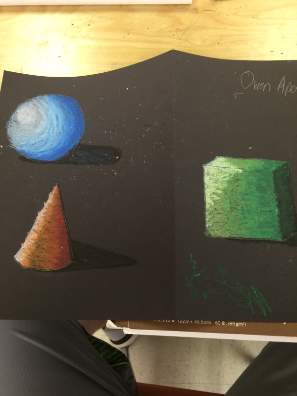
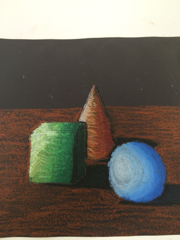
My experience with oil pastels was pretty good. They were a little difficult with adding value at first but it got easier the more I used them. The way I created value was by shading in the medium color i used first and then layering over it in the darker color farther away from the light source. Then I worked on the lighter color closer to the light source so it would look like the light was creating a shadow over the shape. Overlapping was crucial to shading because it provided the shape with a fluent "shadow". If you don't overlap when shading it will look like one color ends and another begins, but it's supposed to be fluent. In my draft I was just messing around and not really focusing on a specific light source for all three shapes, but for my final work I established a light source towards the upper left corner of the paper and it was pretty clear of where it was. Value is important because it provides the shape with depth. If someone didn't shade their shape would look flat and two-dimensional. Shading provides more of a life-like shape and makes it look three-dimensional.
 RSS Feed
