What I Want From Visual Art Class
Art Habits
1. Little Amounts of Planning
Strategies:
• I could focus more on planning ahead on what I'm going to do rather than just jumping into my art which could result in a product that I didn't want
• I could sketch an outline lightly so that I could always change it if needed
2. Dark Marks When Sketching
Strategies:
• Focus on sketching and outlining lighter just in case I have to erase later on
• I could use a lighter pencil which would keep me from drawing dark lines
3. I don't ask for other people's input (although not always a bad thing)
Strategies:
• Consult other people as I'm progressing through my art on what I could do better or change
• Ask for people's opinions on my finished product to learn for next time
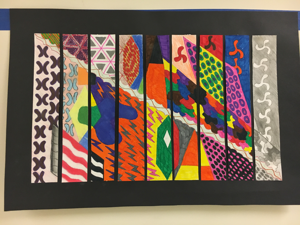
7 Strips
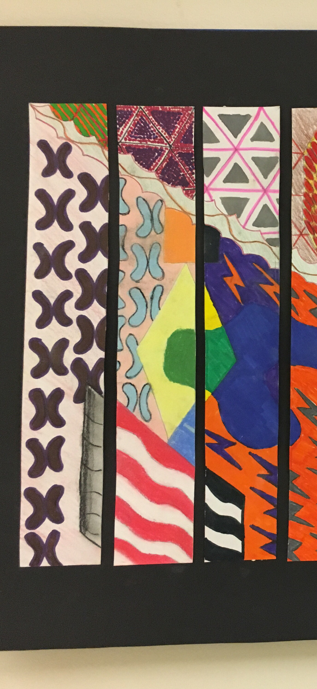
Strip 1 - Space - In the first strip of paper that I worked on I emphasized the element of space. Below the line, which was meant to express harmony throughout the work, surrounding those shapes is space used to contrast the shapes against it. The shapes stick out in the art work because of the contrast between the shapes and the space around them.
Strip 2 - Texture - In the second strip of paper that I worked on, texture was shown. As seen in the strip, the triangles up at the top show a sense of texture through the pattern that is seen. I was trying to give it depth as well, but it didn't turn out exactly as I planned.
Strip 3 - Value - The third strip in the work shows value. A good amount of contrast can be seen in this strip. The flag at the bottom left to the lightning bolts and their backgrounds show contrast which makes each pattern pop out.
Strip 4 - Form - The fourth strip shows form throughout. The lightning bolt patter at the bottom is an example of this because it repeats througout. Another example within this strip is the elongated hexagon above the harmony line because it also shows a pattern within it.
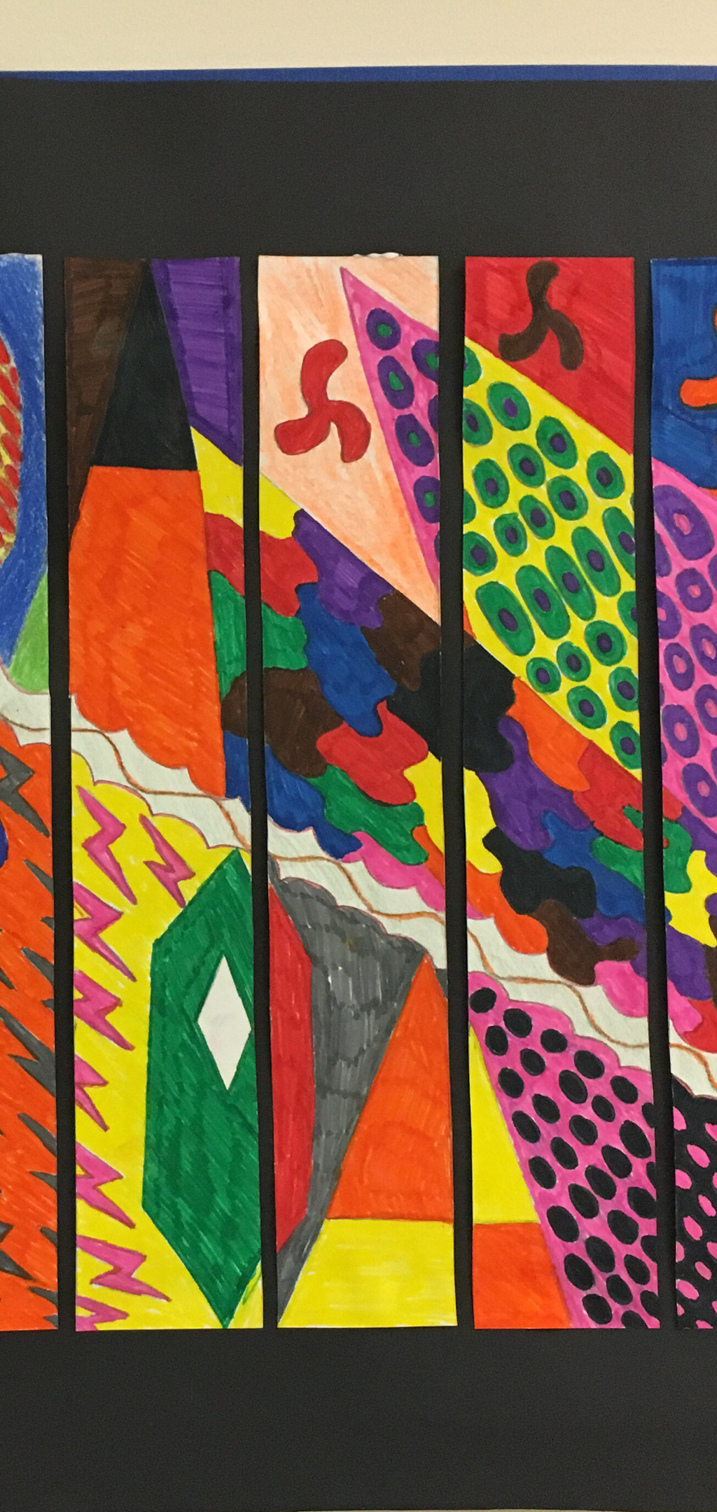
Strip 5 - Shape - Shape can be clearly shown in this strip of the art work. The triangle that is split in two at the top shows a clean shape as well as the hexagon at the bottom of the strip. All of the lightning bolts are geometric shapes as well.
Strip 6 - Line - I feel like it's hard not to have line in any art work that one does so all of these strips could be argued to have line within them. But on the other hand this strip does show a clear line pattern all around it.
Strip 7 - Harmony - Strip 7 is a good representation of harmony because it connects with other pieces within the art. The line that is going through the whole art work runs through Strip 7 which gives it harmony. Also the pattern above the harmony line is also harmony because the color of the shapes along the border of each side continue onto the other strips.
Strip 8 - Scale - Strip 8 can be argued to show scale due to the pattern above the harmony line where the circles keep getting longer as the pattern reaches the middle of the rhombus. This is to make the pattern look more pleasing, at least that's what it was supposed to do.
Strip 9 - Color - I tried to stick to one color of different shades throughout the strip in this one. I did fairly well, but some of the pencil that was supposed to be the same color ended up being different shades due to the differences in how hard I pushed down my pencil. Other than that I feel like the strip clearly shows color.
Strip 1 - Space - In the first strip of paper that I worked on I emphasized the element of space. Below the line, which was meant to express harmony throughout the work, surrounding those shapes is space used to contrast the shapes against it. The shapes stick out in the art work because of the contrast between the shapes and the space around them.
Strip 2 - Texture - In the second strip of paper that I worked on, texture was shown. As seen in the strip, the triangles up at the top show a sense of texture through the pattern that is seen. I was trying to give it depth as well, but it didn't turn out exactly as I planned.
Strip 3 - Value - The third strip in the work shows value. A good amount of contrast can be seen in this strip. The flag at the bottom left to the lightning bolts and their backgrounds show contrast which makes each pattern pop out.
Strip 4 - Form - The fourth strip shows form throughout. The lightning bolt patter at the bottom is an example of this because it repeats througout. Another example within this strip is the elongated hexagon above the harmony line because it also shows a pattern within it.
Strip 5 - Shape - Shape can be clearly shown in this strip of the art work. The triangle that is split in two at the top shows a clean shape as well as the hexagon at the bottom of the strip. All of the lightning bolts are geometric shapes as well.
Strip 6 - Line - I feel like it's hard not to have line in any art work that one does so all of these strips could be argued to have line within them. But on the other hand this strip does show a clear line pattern all around it.
Strip 7 - Harmony - Strip 7 is a good representation of harmony because it connects with other pieces within the art. The line that is going through the whole art work runs through Strip 7 which gives it harmony. Also the pattern above the harmony line is also harmony because the color of the shapes along the border of each side continue onto the other strips.
Strip 8 - Scale - Strip 8 can be argued to show scale due to the pattern above the harmony line where the circles keep getting longer as the pattern reaches the middle of the rhombus. This is to make the pattern look more pleasing, at least that's what it was supposed to do.
Strip 9 - Color - I tried to stick to one color of different shades throughout the strip in this one. I did fairly well, but some of the pencil that was supposed to be the same color ended up being different shades due to the differences in how hard I pushed down my pencil. Other than that I feel like the strip clearly shows color.
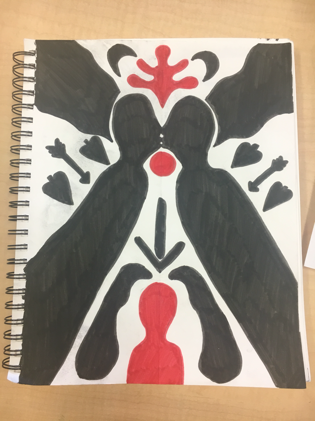
Sketchbook Cliche