|
In this project we were told to draw hands and then draw animals in our hands. I decided to do the owl and the snake for my hands. I used the owl for my final drawing. I tried to be pretty creative and did a hand formation where each of my hands were pressed together. Then I drew the owl on top of my hands. To me my owl looked pretty good. I got most of the features in it but I forgot to put my references in my sketchbook. Overall my experience with drawing the hands and animals was good and I felt like I got much better at drawing hands as well as animals. 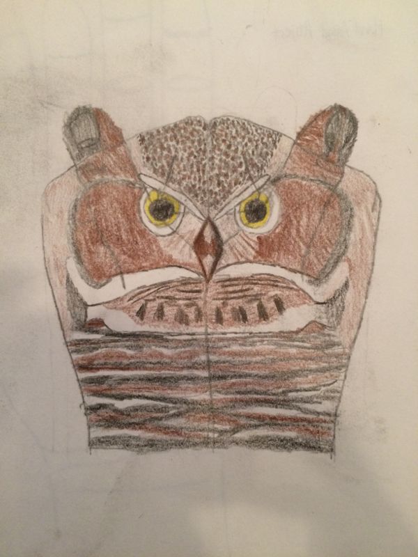
For this project we needed to draw contour drawings of our hands without looking at them. The blind contour drawings were pretty hard for me. It was challenging to get the proportions right and stay in the right places the whole time. In order for it to be perfect it required you to move your pencil with your eyes precisely. Any time you move your hand too fast or your pencil the dimensions of the hand would be off. It was easy to put the detail of the hand in the picture but putting the details in the right place was tricky. Overall, I think I did fairly well for the first time I tried that. I got a little better each time I tried it and it improved my skills for when I was drawing a hand and being able to see it. 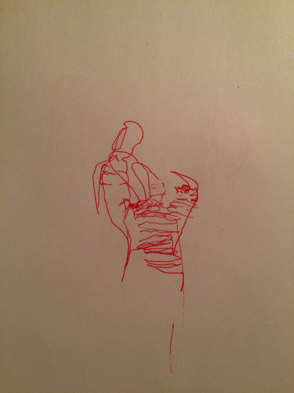
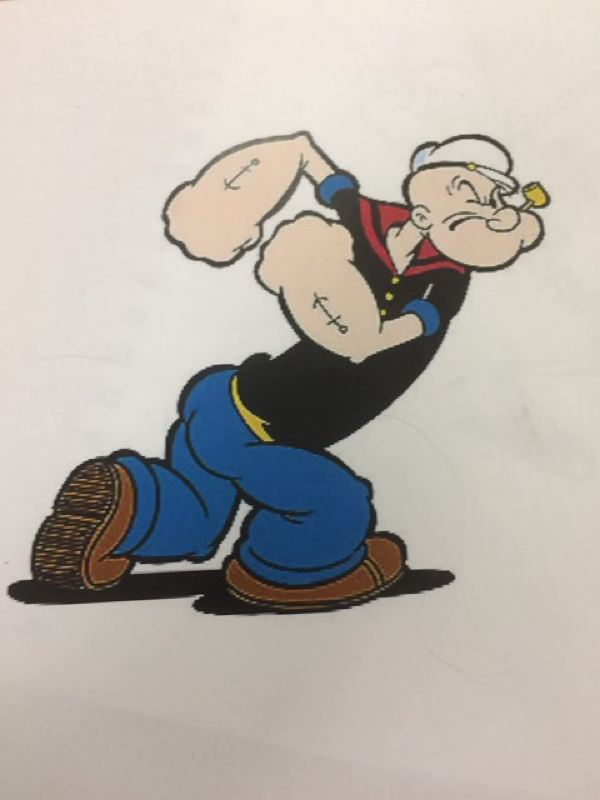
For the cartoon drawing assignment we were required to get images of cartoon characters and draw skeletons of them. I chose Popeye and Finn from Adventure Time. Popeye was pretty difficult considering his whole mouth was on the side of his face which isn't possible but I guess it is in cartoon world. It was challenging because I didn't quite understand how to draw the bones on the other side of the mouth. I tried but it looked better without it. Finn was pretty easy considering he was standing in a normal position facing front in the picture. I decided to make Popeye my final because it was more challenging for me and I felt like I did pretty good on it. The final was backwards due to the tracing paper but it still turned out good. In all this project was pretty fun because I found out I could draw skeletal features pretty well. 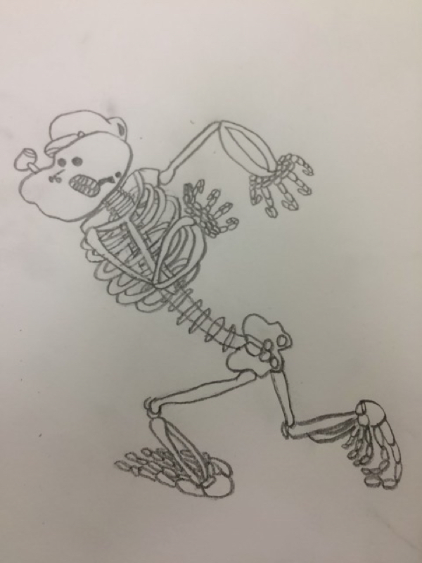
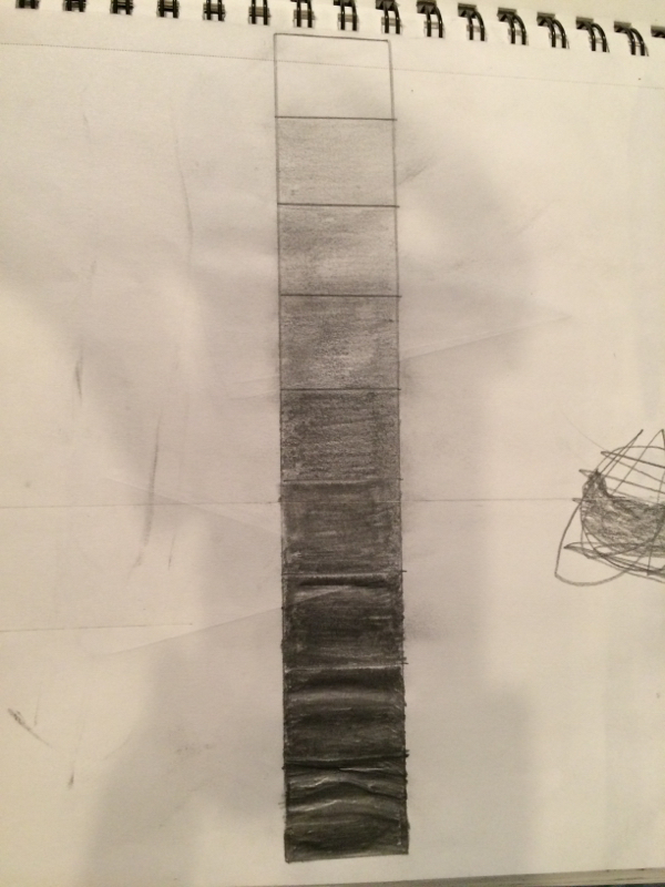
The value chart was pretty hard to make at first because I went from light to dark really fast. The last three squares almost look identical due to this. Shading wasn't that easy to me at first but as I practiced it more on shapes I was able to do it much easier. Shading circles has never been my strongest suit due to the fact that I always get the direction of shading screwed up. Half of it would be a circular looking motion and the other half would be oval so it didn't show its full dimension. Cones proved to be fairly easy for me on the contrary. It was much easier to get the shading right on those probably due to the fact that the shading motion was easier to perform. Although I do enjoy shading with pencil, charcoal is way better. It just naturally shades itself and looks better. It doesn't take as much effort to make one shade flow into another as it would with pencil. I feel that these shading activities improved my capabilities as an artist. The value chart was pretty hard to make at first because I went from light to dark really fast. The last three squares almost look identical due to this. Shading wasn't that easy to me at first but as I practiced it more on shapes I was able to do it much easier. Shading circles has never been my strongest suit due to the fact that I always get the direction of shading screwed up. Half of it would be a circular looking motion and the other half would be oval so it didn't show its full dimension. Cones proved to be fairly easy for me on the contrary. It was much easier to get the shading right on those probably due to the fact that the shading motion was easier to perform. Although I do enjoy shading with pencil, charcoal is way better. It just naturally shades itself and looks better. It doesn't take as much effort to make one shade flow into another as it would with pencil. I feel that these shading activities improved my capabilities as an artist. 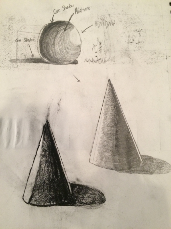
The value chart was pretty hard to make at first because I went from light to dark really fast. The last three squares almost look identical due to this. Shading wasn't that easy to me at first but as I practiced it more on shapes I was able to do it much easier. Shading circles has never been my strongest suit due to the fact that I always get the direction of shading screwed up. Half of it would be a circular looking motion and the other half would be oval so it didn't show its full dimension. Cones proved to be fairly easy for me on the contrary. It was much easier to get the shading right on those probably due to the fact that the shading motion was easier to perform. Although I do enjoy shading with pencil, charcoal is way better. It just naturally shades itself and looks better. It doesn't take as much effort to make one shade flow into another as it would with pencil. I feel that these shading activities improved my capabilities as an artist. In this assignment we had to draw modified contour drawings of shoes that were payed out on the table. I accidentally did this in pencil and I had no time to redo the drawing but I thought the drawing wasn't that bad. The shoe really didn't have that much detail to it so I couldn't do too much with it. It was challenging to get the dimensions of the shoe when it wasn't facing completely left or right to me but for the most part I was fine with it. Shading would have made this shoe stand out much more but we hadn't learned about it yet. I messed up on some of the proportions of the shoe including the bottom near the heel of it. The proportions on the whole thing are off but it's hard to look at a shoe three feet away and draw the actual size of it due to depth perception. I'm the end the shoe came out better than I expected it would so that's a plus. 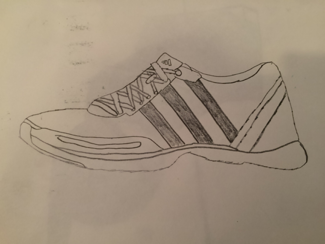
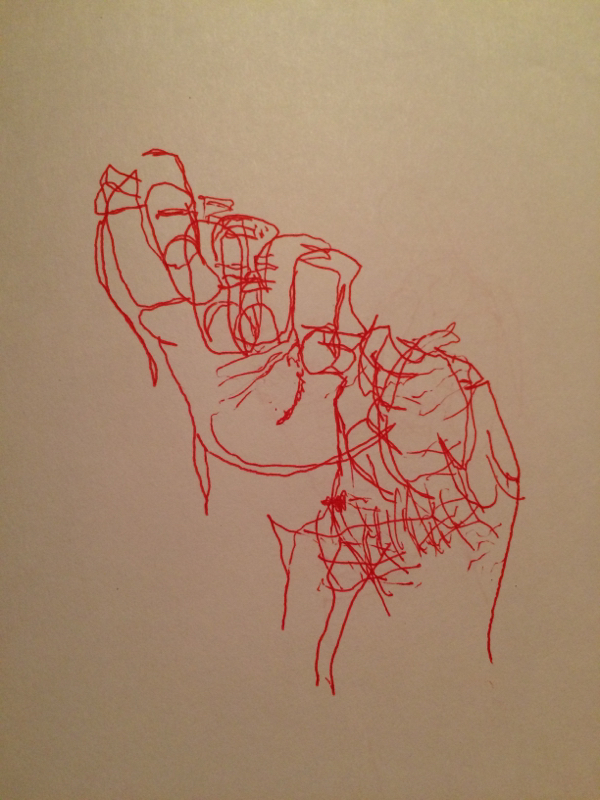
For this assignment we drew contour drawings of our hands and we were able to observe our hand in the process. The modified contour drawings were fairly easy due to the fact that we practiced blind contours right before we did them. It just made it feel easier and I was able to capture more detail in the hand. Although I messed up on the dimensions of the hand a little this was my best piece. Putting the lines and creases of the hand in the picture helped it to become more realistic and detailed. Shading would've also helped to do this but we hadn't done a lesson on shading before this. To me my drawings look pretty good but there is always room for improvement and one I start practicing modified contours my pictures will be even better. 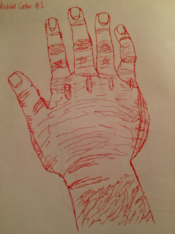
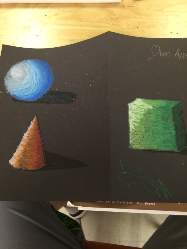
My experience with oil pastels was pretty good. They were a little difficult with adding value at first but it got easier the more I used them. The way I created value was by shading in the medium color i used first and then layering over it in the darker color farther away from the light source. Then I worked on the lighter color closer to the light source so it would look like the light was creating a shadow over the shape. Overlapping was crucial to shading because it provided the shape with a fluent "shadow". If you don't overlap when shading it will look like one color ends and another begins, but it's supposed to be fluent. In my draft I was just messing around and not really focusing on a specific light source for all three shapes, but for my final work I established a light source towards the upper left corner of the paper and it was pretty clear of where it was. Value is important because it provides the shape with depth. If someone didn't shade their shape would look flat and two-dimensional. Shading provides more of a life-like shape and makes it look three-dimensional. 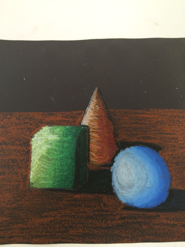
|
AuthorWrite something about yourself. No need to be fancy, just an overview. Archives
May 2015
Categories |
 RSS Feed
