Polygon Portrait
For this project I incorporated some of the skills I had learned in past art classes like collage and contrast. I feel like this project was creative on my part. I used magazine ads for all of my face and then created the background by cutting both white and black paper and alternating them. The analogous color scheme that I used was blue, green, and blue-green. This worked well in my mind because they are very familiar colors and don't stand out too much from each other. My portrait says that I am creative and love nature. All of my portrait was either cutouts of the sky, water, or grass/trees. If I could redo this project I would probably change my color scheme. Although it is reflective of who I am, many other people were doing this color scheme so it wasn't as creative as I would've hoped it would be. Though I've said this, in the end it turned out pretty well in my opinion so that's good.
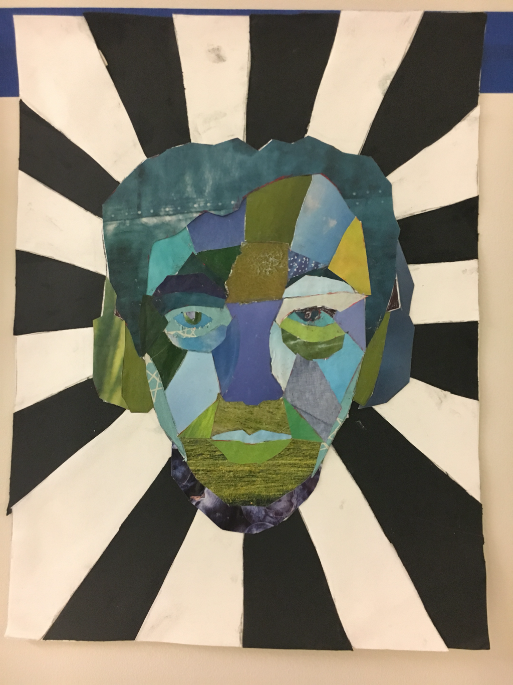
For this project I incorporated some of the skills I had learned in past art classes like collage and contrast. I feel like this project was creative on my part. I used magazine ads for all of my face and then created the background by cutting both white and black paper and alternating them. The analogous color scheme that I used was blue, green, and blue-green. This worked well in my mind because they are very familiar colors and don't stand out too much from each other. My portrait says that I am creative and love nature. All of my portrait was either cutouts of the sky, water, or grass/trees. If I could redo this project I would probably change my color scheme. Although it is reflective of who I am, many other people were doing this color scheme so it wasn't as creative as I would've hoped it would be. Though I've said this, in the end it turned out pretty well in my opinion so that's good.
 RSS Feed
